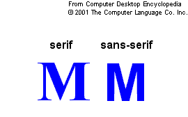
The typeface, sans serif (French for, "without serifs") first appeared at the beginning of the 19th century and was referred to as "Egyptian" font. The name "Sans Serif" refers to a typeface that does not have winged tips on the end (see figure 1). The name comes from the roman typeface "Serif" which has is the opposite of sans serif typeface. It was first used in 1816 in a type sample book by William Caslon.
This new typeface began to grow quickly in popularity all over the US and Europe, appearing under such titles as "grotesque" and "sans serif." Traditionally, serif letters were used because the scribes could not leave a clean line with their quills. The use of serifs also helped the eye stick to the line and therefore make reading easier. Generally the serif form of typeface is thought to be more old fashioned and grounded in history and tradition, while sans serif presents a new, more modern approach.
http://www.webreference.com/dlab/9802/sansserif.html

The Transition
At first sans serif created much controversy because people had been so used to the traditional serif form; hence the name "grotesque." The alphabet began to take on many different styles and variations, ranging from slender to bold letters. The letters in the lower case still basically retained the similarity of the roman type. It was the capital letters that were more drastically altered.
All the letters from A to Z were now similar in width, whereas before letters such as B and E were narrower and T and M were wider. These new typefaces were only used in typesetting for titles and headlines. The body text was still done in the traditional roman form of typeface. This situation endured for one hundred years, and it was not until after World War II that sans serif typeface began to revolutionize the world of text publishing.
During the 1920's there were many attempts to change the shape and style of the letters in the alphabet. Many people attempted such experiments as lengthening the letters and trying to construct them exclusively from lines and circles.
During World War II the invention of new typeface styling was brought to a halt. Only in Switzerland did innovation continue to grow. Instead of using typefaces like Futura and Erbar, there began to be a rediscovery of the sans serif typeface used at the end of the 19th century. At the beginning of the 1950's, people began the actual work of constructing typefaces in this style. These typefaces had no typical models, and had strongly emphasized thick-thin contrasts and somewhat angular ovals. http://www.linotype.com/2258/thehistoryoflinearsansseriftypefaces.html
Structure and Spacing
Compared to the lowercase letters the uppercase letters were considerably smaller in size. The spacing was also changed so the letters were closer together. The reason for this was because in serif typeface the letters had were spaced farther apart because the serifs required more room.
The new technology of photosetting allowed for complete freedom in determining the spacing between letters. This movement led to the crowding of letters up to the point where they became absurdly difficult to read. All through the 1950's and 60's new versions of the sans serif typeface were being developed. Typefaces such as, Excoffon, Aldo Novarese and Eurostile were very popular and used frequently.


No comments:
Post a Comment